Threshold Maps in EJScreen

The threshold map widget allows EJScreen users to look across all twelve indexes at once, providing a cumulative outlook on vulnerable populations facing higher pollution burdens.
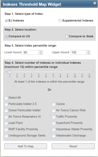
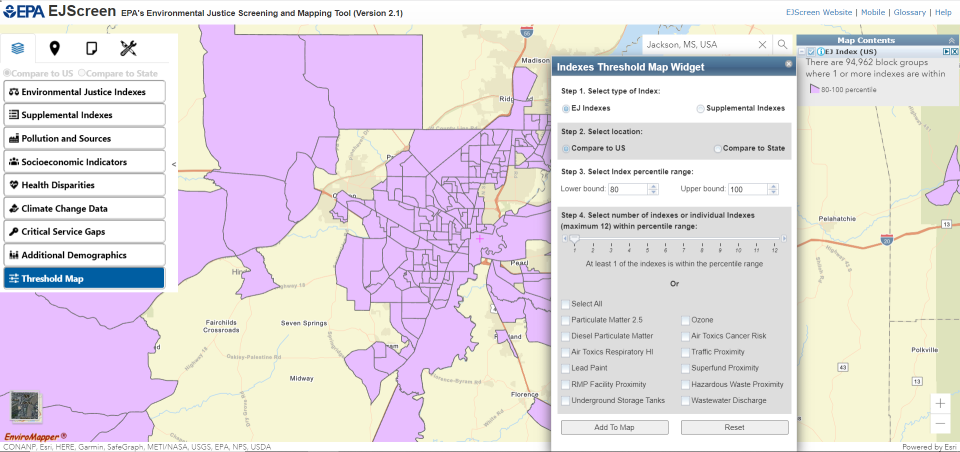
Users select a percentile range, for example the 80th to 100th percentile, and the tool then maps places where one or more of the indexes is within that range. The tool also allows users to select the number of indexes within the user-defined range or to select specific indicators of interest. Threshold maps are available for both the EJ indexes and the supplemental indexes and are available for comparison at the national and state level.
Prior to the inclusion of threshold maps, EJScreen only provided the indexes individually and did not provide a combined map of all twelve indexes on one map. The threshold maps offer users the capability to take a broader view of the indexes to help highlight areas that may warrant additional consideration, analysis, or outreach.

